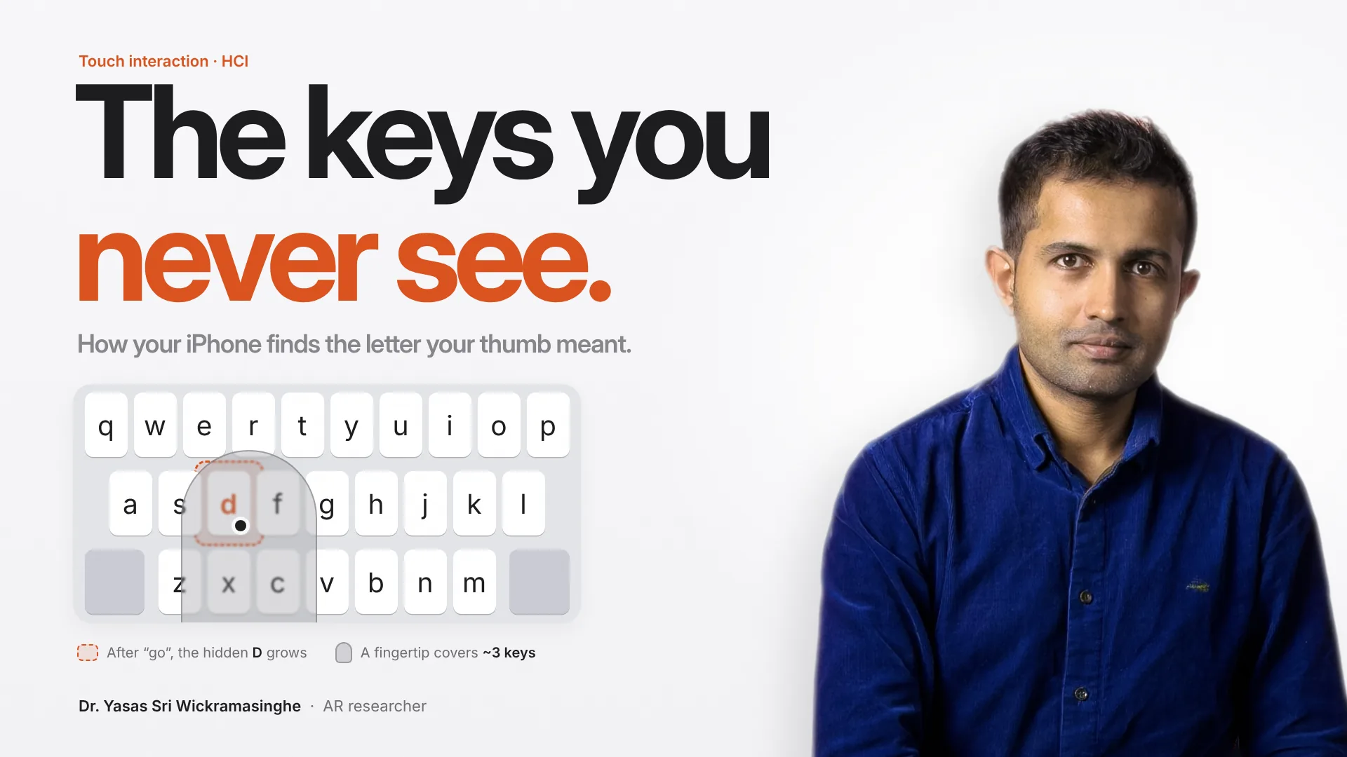
Try this the next time you pick up your phone. Rest your thumb on the keyboard and look at how many keys disappear under it.
Here are a few facts that changed how I see that little keyboard:
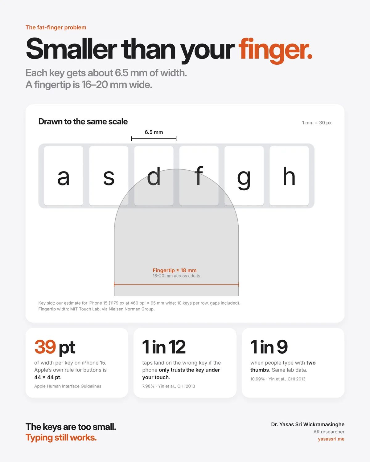
- Each key on an iPhone 15 gets about 6.5 mm of width, gap included. That's my estimate from Apple's own specs: a screen 1179 pixels wide at 460 pixels per inch is about 65 mm across, and the top row holds 10 keys.
- A typical adult fingertip is 16 to 20 mm wide. One touch covers roughly three keys.
- The keys are below Apple's own minimum. Apple's design guidelines say a button needs a hit region of at least 44 × 44 points. A key on that iPhone gets about 39 points of width.
- Research on one-handed thumb typing recommended targets of about 9.6 mm. The keyboard gives you about two thirds of that.
- In one lab dataset, about 1 in 12 taps landed outside the key the person meant. With two thumbs it was closer to 1 in 9. That's the error rate you'd get if the phone simply trusted the key under your finger.
And yet most of us type all day without thinking about it.
So what's going on? The short answer: the keyboard you see isn't the keyboard you type on. There's a second, invisible keyboard underneath, and it changes shape with every letter you type.
I find this one of the most beautiful pieces of everyday interaction design. Let me explain why.
Why I care about this
I'm an AR researcher. My work is about how people interact with digital things that live in the physical world: multiplayer location-based AR games, presence in VR, and why some people feel sick in virtual environments. Before research, I spent years building software as a technical lead.
Across all of that, one question keeps coming back: what did the person actually mean to do?
In AR and VR there's often no surface to press. You point with a hand, a controller or your eyes, and every one of those signals is noisy. The phone keyboard is where this problem was first solved for almost everyone, in everyday life. If you design interactive systems of any kind, I think it's worth understanding how.
The problem Apple had in 2005
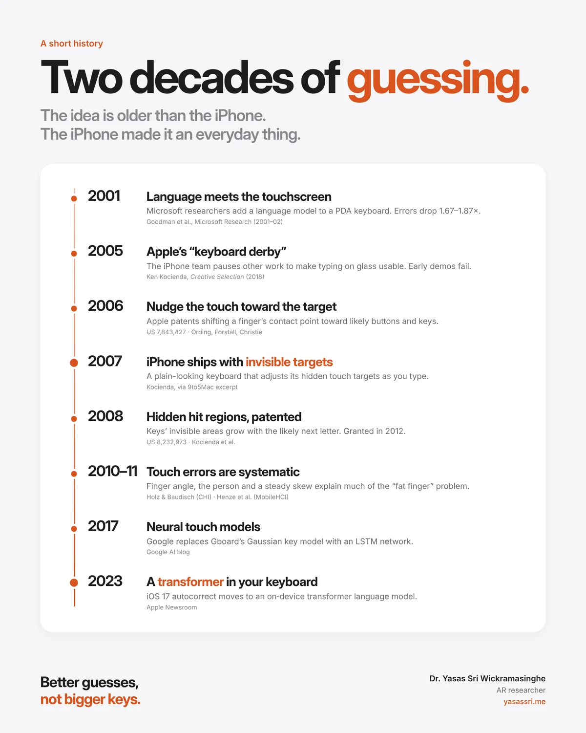
Ken Kocienda, one of the engineers who built the original iPhone keyboard, tells this story in his book Creative Selection (2018).
In late 2005, Scott Forstall paused other work on the iPhone software team so everyone could try to solve one problem: typing on glass. Kocienda calls it a "keyboard derby". Early in the project the team had found that buttons needed to be about 44 pixels wide to be easy to tap. A full QWERTY layout on that small screen simply didn't fit at that size.
The derby winner grouped several letters onto each big key and guessed the word you meant. It didn't survive contact with executives. According to the excerpt published by 9to5Mac, Phil Schiller's demo lasted about two minutes. Tony Fadell's was shorter.
What finally shipped in 2007 looked ordinary: a plain QWERTY keyboard. The magic was invisible. As 9to5Mac's write-up of the book puts it, the keyboard "intelligently adjusted the invisible touch targets on-the-fly."
Problem one: you aim with one part of your finger and touch with another
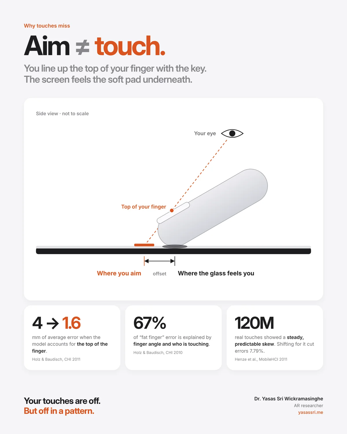
Here's something most of us never notice. When you aim at a key, you line up the top of your finger, roughly the nail, with the target. But the screen doesn't see your nail. It senses the soft pad underneath, which sits a few millimetres away from where you think you pressed.
Christian Holz and Patrick Baudisch studied this in detail. In a 2011 paper, Understanding Touch, they showed that users align visual features on the top of the finger. When they modelled touch that way instead of using the contact area, the average error offset dropped from about 4 mm to 1.6 mm.
A year earlier, they had shown that 67% of the inaccuracy blamed on the "fat finger" problem could be explained by two things: the angle of the finger, and differences between people.
The key word here is systematic. Niels Henze and colleagues released a simple Android game that asked people to tap circles. It collected over 120 million touches from more than 91,000 installations. Touches were skewed in a consistent, predictable way. When they shifted touches to compensate, errors fell by 7.79% for real players.
That's good news. If your mistakes are random, there's little a computer can do. If they follow a pattern, it can learn the pattern.
Apple seems to have been thinking along these lines very early. A patent filed in 2006 (US 7,843,427, by Bas Ording, Scott Forstall and Greg Christie) describes taking the centre of a finger's contact area and then shifting it toward nearby buttons, weighted by how likely each one is to be the target. Its soft keyboard example raises the weight of "D" after you've typed "Go".
Problem two: the key you touched isn't always the key you meant
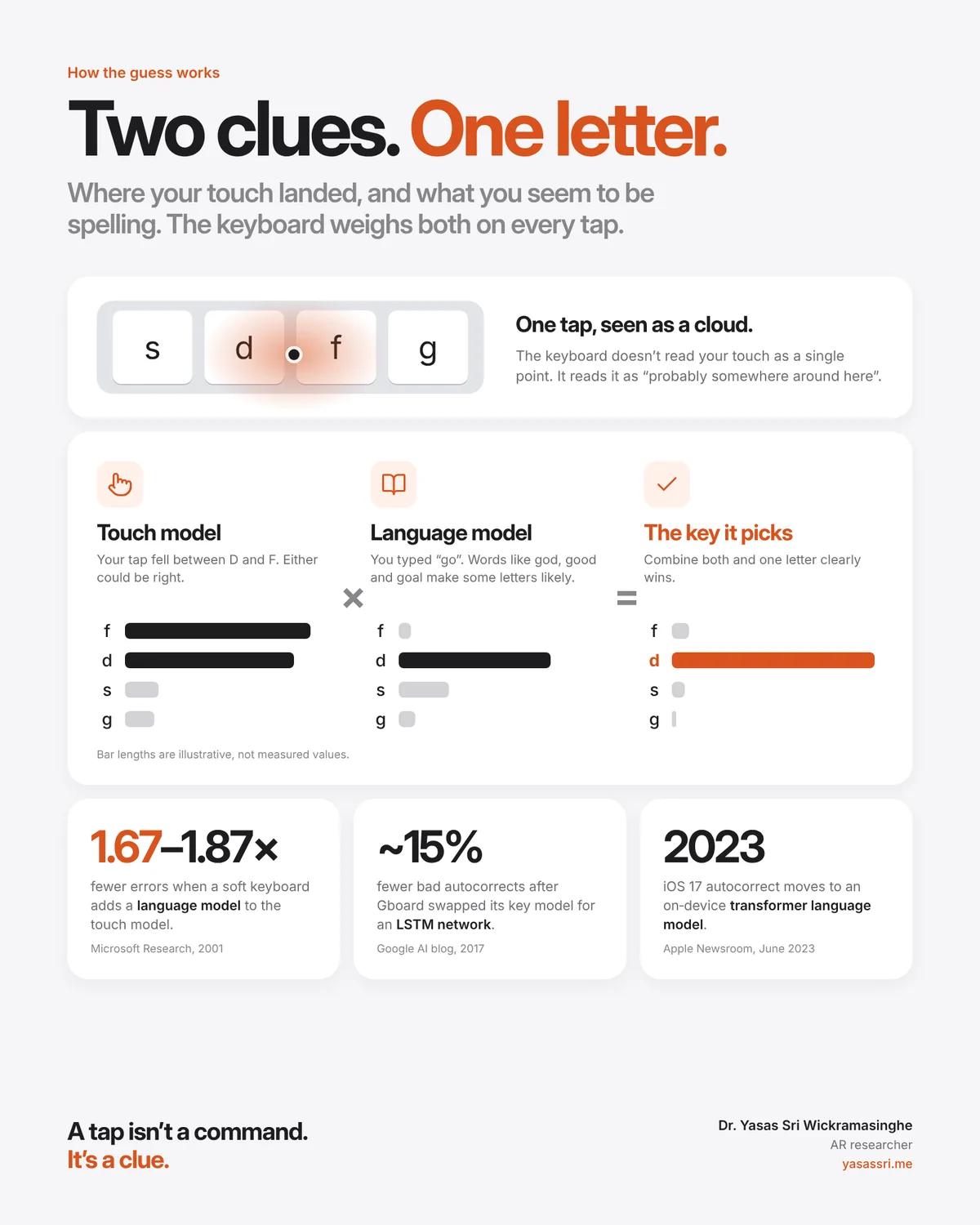
Fixing the offset helps, but a 6.5 mm key under an 18 mm finger is still ambiguous. Your touch might land right between D and F. Which one did you mean?
This is where the invisible keyboard comes in.
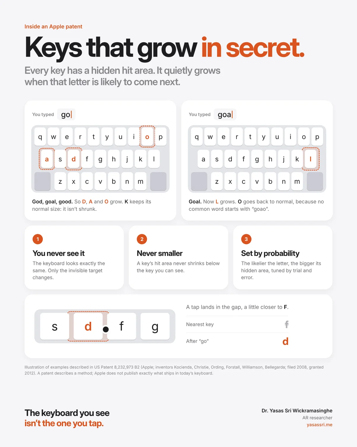
Apple's patent US 8,232,973 (filed 2008, granted 2012; inventors include Ken Kocienda, Bas Ording, Greg Christie, Scott Forstall, Richard Williamson and Jerome Bellegarda) describes it clearly. Every key has a hidden hit region. The keyboard looks the same, but the hidden regions grow and return to normal as you type.
The patent uses an example I love:
- You type "go". Words like god, goal and good are common, so the hidden areas of D, A and O grow.
- K is unlikely, because few common words start with "gok". But its area doesn't shrink. It stays the size of the key you can see.
- You type an "a". Now goal is likely, so L grows. O goes back to normal, because no common word starts with "goao".
Two design rules sit inside that example, and they matter:
- A key's touch area is never smaller than the key you see. If you aim precisely at a key, you get that key.
- Unlikely keys are never punished. The keyboard helps you, but it doesn't block you.
How much does each area grow? The patent ties it to the probability of the next letter and a tuning constant that, in its own words, is found by trial and error. I find that refreshingly honest.
One caution: a patent describes a method, not necessarily what ships today. Apple doesn't publish the exact algorithm in your current keyboard. Kocienda's account confirms that the 2007 keyboard adjusted invisible touch targets. The details have surely evolved since.
Two clues, one letter
Step back and the idea is simple. Every tap gives the keyboard two clues:
- Where your touch landed. Not as a single point, but as a "probably somewhere around here" cloud. Researchers call this a touch model or spatial model.
- What you seem to be spelling. Given the letters so far, some next letters are far more likely than others. That's a language model.
Multiply the two together and one letter usually wins clearly.
Apple wasn't the first to see this. In 2001, Joshua Goodman and colleagues at Microsoft Research combined a language model with a key-press model on PDA keyboards. They reduced errors by a factor of 1.67 to 1.87.
Others have pushed it further since. In 2010, a team at Microsoft Research (Gunawardana, Paek and Meek) warned that resizing keys too aggressively can stop people typing what they actually intend. They proposed an "anchored" approach that keeps each key's core reachable, the same spirit as Apple's "never smaller than the visible key" rule. In 2017 Google explained that Gboard had replaced its older Gaussian key model with a neural network (an LSTM). It reported about 15% fewer bad autocorrects in offline tests.
In 2023 Apple announced that iOS 17's autocorrect uses an on-device transformer language model, the same family of AI models behind today's chatbots, running inside your keyboard.
Your hands are not my hands
There's one more layer that I find fascinating as an HCI researcher: everyone touches differently.
Holz and Baudisch found that finger angle and the individual explain much of the error. Daryl Weir and colleagues (UIST 2012) trained a model on one person's own touches. It worked better than a model pooled across people, and needed only about 200 examples to make a meaningful difference. Ying Yin and colleagues at Google (CHI 2013) built a keyboard that adapts to the key, your hand posture and you as an individual. It cut errors by 13.2% in their prototype.
The best interfaces don't just understand people in general. They understand this person, holding the phone this way, right now.
What this teaches us beyond phones
I think about this keyboard a lot in my own field, because AR and VR are facing the same problem again, only harder.
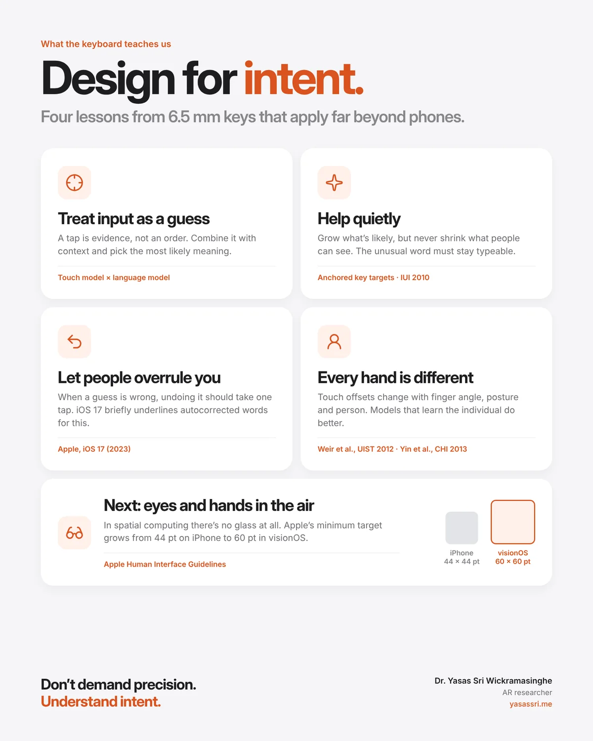
On a phone, at least your finger touches glass. In spatial computing there may be no surface at all. You pinch the air, look at a button, or point a hand that's being tracked by a camera. Apple's own guidelines reflect this: the minimum target size grows from 44 × 44 points on iPhone to 60 × 60 points in visionOS.
We can't make people more precise. Bodies are what they are. What we can do is build systems that understand intent. The keyboard gives us four lessons that I believe carry over to any interface:
- Treat input as a guess. A tap, a gaze or a gesture is evidence, not an order.
- Help quietly. Grow what's likely. Never shrink what people can see.
- Let people overrule you. iOS 17 briefly underlines autocorrected words so you can tap to undo them. Undoing a wrong guess should take one tap.
- Remember that every hand is different. Design for the person, not the average.
A closing thought
Next time your phone types exactly the word you meant, even though your thumb clearly landed somewhere else, take a second to appreciate what just happened. Two invisible models agreed on what you meant, in the time it took your thumb to lift.
The keys you see are only the surface. The keys that do the work are the ones you never see.
A few lines I keep coming back to:
The best interface doesn't demand precision. It understands intent.
A tap isn't a command. It's a clue.
Good design helps quietly and steps aside when you know better.
We can't make fingers smaller. We can make software wiser.
If you build anything people touch, point at or look at, that's the job. Not bigger buttons. Better guesses.
What's an interface you use every day that seems to "just know" what you meant? I'd love to hear it in the comments.
Sources
- Apple: iPhone 15 technical specifications (2556 × 1179 px at 460 ppi).
- Apple Human Interface Guidelines: Buttons (44 × 44 pt; 60 × 60 pt in visionOS).
- Nielsen Norman Group: Touch targets on touchscreens (fingertip width 1.6–2 cm, MIT Touch Lab).
- Parhi, P., Karlson, A. K., & Bederson, B. B. (2006). Target size study for one-handed thumb use on small touchscreen devices. MobileHCI.
- Yin, Y., Ouyang, T., Partridge, K., & Zhai, S. (2013). Making touchscreen keyboards adaptive to keys, hand postures, and individuals. CHI.
- Azenkot, S., & Zhai, S. (2012). Touch behavior with different postures on soft smartphone keyboards. MobileHCI.
- Kocienda, K. (2018). Creative Selection. Excerpt via 9to5Mac.
- Holz, C., & Baudisch, P. (2010). The generalized perceived input point model. CHI.
- Holz, C., & Baudisch, P. (2011). Understanding touch. CHI.
- Henze, N., Rukzio, E., & Boll, S. (2011). 100,000,000 taps: analysis and improvement of touch performance in the large. MobileHCI.
- Ording, B., Forstall, S., & Christie, G. Methods for determining a cursor position from a finger contact with a touch screen display. US 7,843,427.
- Kocienda, K., et al. Method, device, and graphical user interface providing word recommendations for text input. US 8,232,973.
- Goodman, J., Venolia, G., Steury, K., & Parker, C. Language modeling for soft keyboards. Microsoft Research.
- Gunawardana, A., Paek, T., & Meek, C. (2010). Usability guided key-target resizing for soft keyboards. IUI.
- Beaufays, F., & Riley, M. (2017). The machine intelligence behind Gboard. Google Research Blog.
- Weir, D., Rogers, S., Murray-Smith, R., & Löchtefeld, M. (2012). A user-specific machine learning approach for improving touch accuracy on mobile devices. UIST.
- Apple Newsroom (June 2023): iOS 17 makes iPhone more personal and intuitive.
- 9to5Mac (June 2023): iOS 17 autocorrect (underlined corrections, tap to revert).
Note on the 6.5 mm and 39 pt figures: these are my own calculations from Apple's published iPhone 15 specs (1179 px ÷ 3 = 393 pt wide, 10 keys in the top row). Actual key caps are a little narrower than the slot, because of the gaps.
Also published on LinkedIn.